Friday, May 2, 2008

Floral Integration Methods (final)

Final Day

I ended the trip at Coney Island, falling into the Atlantic Ocean. Which apparently comes as a surprise to just about no one. Thank god it was out on a rock jetty and not on the beach where I could have been unlucky enough to fall on some of the sand mixed in with the broken glass. This is where I fell in.

I really liked New York. It was not a bad time.

A List of the New Essentials (Day 6)

The Armory Show

I liked a lot of the work at the Armory Show. I did not like the Armory Show. It felt a like my idea of Wall Street--which I did not see in New York. People were predicting where the market was going, talking off the cuff about exorbitant amounts of money, and you know... wearing suits. As if business had been driving along, seen the art sticking its thumb out on the edge of the interstate and decided it would make for a good story if they gave it a lift. On a side note I pulled a huge faux pas when in an attempt to take my sweatshirt off I pulled off my regular shirt. All the way. There were nipples and embarrassment flying all over the place, like glass during a head on car crash. About the actual fair/show/whatever, here are some great Holzer pieces...


Also there was a large Ryan McGuiness that was pretty fancy,

and a Barry McGee,

and this illustration.

The Hidden Dangers of Making Your Own Paper (Day 5)

Sculpture Center Tom Burr

The general consensus seemed to be that Tom Burr’s work was impressive due to the level of thought behind each and every one of his decisions. After some of my own thinking I believe this to be incorrect. Or perhaps correct, but not super important. It might be more fitting to say that the decisions he is making are blatant. So much so that it’s like Tom Burr is standing in the room with you, slapping you in the face.

Now I like that. I like that a lot more than just thinking Burr was careful with his choices and that he thought long and hard about all of them. He’s a well known artist, working conceptually and should damn well be thinking about his choices. I almost feel it’s more important that his work feels constructed than why he’s making the choices. That somehow having to make these choices is important in process only, and the development of a theatrical environment.

Wack! (P.S.1)

In the stylings of Sherrie Levine I’m just going to link you to what Caitlin wrote... http://cburkhart.blogspot.com/2008/03/ps-1.html.

Thursday, May 1, 2008

Is the Coptic Stitch Right For You? (Day 4)

MOMA (color chart)

I like color. It would appear that many artists also like color. Our interests are so in tune with one another that I think I may just have to friend them on facebook. I’m going to “poke” you Baldessari!

I’m always amazed at the discussion that goes on over color being under-represented. David Batchelor’s Chromophobia heatedly argues an existing prejudice against color. The MOMA exhibition is in a way antithetical to this view. Color has been used, liberally even, for a long time when it comes to, not just art, but design as well. Color has not been put on the sideline in favor of some monochromatic dystopian future. But, rather finds its way into almost all work at some level, and only when conceptually necessary is it omitted.


Whitney Biennial

The Whitney Biennial was curated to showcase the lesser known and the up and coming. It was, coincidentally, awful. There were several exceptions to this rule. Along with a pants poopingly good film by Omer Fast, there was a great series of sculptures by Walead Beshty. Like a glove over an aquarium, multiple Fed Ex boxes were fitted over glass cubes, which were then shipped to the Whitney. The cracking, splintering, and subsequent buckling of the glass cubes chronicled their trek through the shipping system. I feel that these were likely chosen for material reasons. The simplicity and relatively cheap/simple construction of the work played into the idea of new artworks, as if the curator wanted to be positive that those who visited the Whitney knew exactly what they were looking at.

Ten Collage Don'ts and Three Collage Do's! (Day 3)


Chelsea is so hip that even the buildings have gradients applied to them. Chelsea? More like Chelsea 2.0.

Marcel Dzama

If I had the same first name as Ducamp I’d probably make some referential artwork as well. Though I might make it a little more in line with the other work I was showing in the same room. Dzama, who is clearly diorama crazy, went with a series of found objects over his typically fabricated ones to use behind his peepholed door. I thought this was a strange choice, and I have to wonder if it would have been stronger were it a re-interpretation of Duchamp’s piece using the language Dzama has already developed. Beyond this though I would have to say that I liked the piece. I’m not sure of the level of intention behind it, but the wood adjacent to the peephole was stained with what I assumed was disgusting face grease. Fearing acne this made me very careful not to put my eye right up against the door. The idea of this door being a shared experience, one where the imprint of the viewers leaves a physical imprint on the piece is... nice.

Installations

I was genuinely surprised by the amount of installation work in Chelsea. This being very much the opposite of what I would have expected inside of a gallery. Both of these pieces were clearly constructed for the site (or at the very least adapted for the site).


This one is hilarious.

Brian Jungen
I think what Jungen had on display in Chelsea, the football jerseys woven into Native American Blankets, was great conceptually. Unfortunately they were very similar to his well known masks made from appropriated Air Jordans. Even his whale skeleton constructed of plastic lawn chairs. I think the problem I’m having is that he has managed to make such visually arresting objects, which are, at the same time rock solid conceptually. Not really a problem, but when he makes something with the same concept, that he has used in previous work, but which is now stronger than the physical execution of a piece... is misleading? Maybe the pieces are strong in a different way, his understating of the physical in the work contributing to something. Or maybe I am just not a huge blanket fan.

DiVa Containers

The DiVa containers were a series of cargo containers that were supposed to be showcasing “new media art,” whatever the hell that is. Judging from most of the work shown it just means video on an LCD screen. Which I don’t have a problem with. It’s just that I’m not sure if I would classify this as “new media”. For that matter I would prefer not to classify anything as “new media”. I thought the whole categorizing fad had finally blown over.

There were of course exceptions... There is a pink Chinese lion in the middle of one of the DiVa containers in Chelsea. The head rotates 360 degrees projecting a mirrored video of a symphony orchestra from it’s eyes. Now the connections here wasn’t entirely clear to me at first. In fact the connection is still not clear to me. But, after thinking on it several times over a period of hours It might have something to do with reflection hiding the individual. The orchestra is obscured and distorted through the reflection, but the lion missing its partner is easy to examine as an individual object. Maybe this is a sort of cultural reflection where one culture views another as a continuously reflected entity. Like the reverse of one individual standing between two mirrors and being perceived as a crowd.

Thread Count In Book Cloth. Important? (Day 1)

Jasper Johns Grey (The Metropolitan Museum)

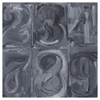
I had problems with this show. Presumably because the whole thing was Jasper Johns pounding on one idea over and over, just like my neighbors playing Rock Band at four in the morning. I get it. Grey. It’s fantastic you’re trying to purge color from your work. Good going Johns, this is about as grey as it gets. Could you maybe do it on a hundred more canvases and a couple drawers? Perfect. Done.

What I’m really trying to get at though is this. If I had a friend working on a novel and he, we’ll say is on his tenth draft, and feels it’s time to show it around to people. So, he comes to me and tosses down a tall stack of paper, classic triple at Wendy’s thick. And I’m like hey buddy, what’re all these? And he’s like, they’re my ten drafts, I want you to understand my process. Now, being a good friend I decide to play along and I read the first draft and I bite, it’s fantastic. I’m amazed, how’d you think of this? So, excited, I get to the second draft and realized that nothing is really that different. The grammar and spelling are a little better, a character has a different name. As the good friend I previously specified myself, I read the rest of the drafts. And they’re all the same thing... small grammar changes, word choice things, chapter titles are now just numbers. And after a lot of reading I, finally, put down the tenth draft which is largely unchanged from the first that I loved so much. But, this time when I put down the draft I hate it, I don’t want to read it again. In fact I don’t even like the first draft anymore.

The Jasper Johns Grey show is reading the same novel ten times in a row, expecting a great revelation with each new beginning. Just like my friend’s novel there are great moments within it, but they feel like a series of paintings that was not meant to be shown like... that. Were I to look at them on an individual level though...

Separating color from his methods allows Johns to lean heavily on the text he is using within his paintings, they become representations of objects that exist theoretically somewhere else. Of course it being Jasper Johns they probably do exist somewhere else. What’s particularly amusing about this though is that a grey painting thought of in terms of color wouldn’t be interpreted as the existing color version. Take “False Start” and “Jubilee”, in “False Start” words describe colors but are themselves painted in a color that they are not (blue is orange for example), but the type in “Jubilee” is greyscale. We imagine the colors that are being described without the confusion present in the original painting.

Violence in Cai Guo-Qiang (Guggenheim)

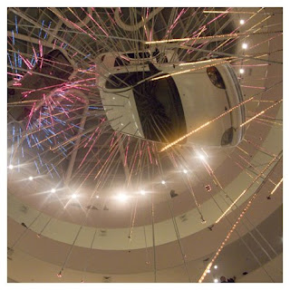
Despite the large percentage of the surfaces within the Guggenheim that were pierced by arrows I found Cai Guo-Qiang works non-violent. I didn’t even find them psuedo-violent or Tom and Jerry violent. They were Disney theatrical, Disney ice capades theatrical executed in such a way that I would be as likely to be startled by the unused toilet paper under my bathroom sink. Even the “exploding” car rocketing up the middle of the museum starts and finishes with a car sitting safely on the ground. More so, the wires that support the cars look so rock steady that the whole thing looks like less of a series of frozen moments and more like changing snow tires at Les Schwabb.

That said I really enjoyed the exhibit. Guo-Qiang appears to have the tennis balls to keep materials materials. Because resting immediately behind his vast series of illusions is their origins in normalcy. There is a distillation of the spectacle in his work. As if Cai had spent his career in an Appalachian pig farmer’s back field with a series of tubes, funnels, and boilers, ending up with a clear liquid that will get you shit-faced ten seconds before you drink it. We were all lucky not to have gone blind.